
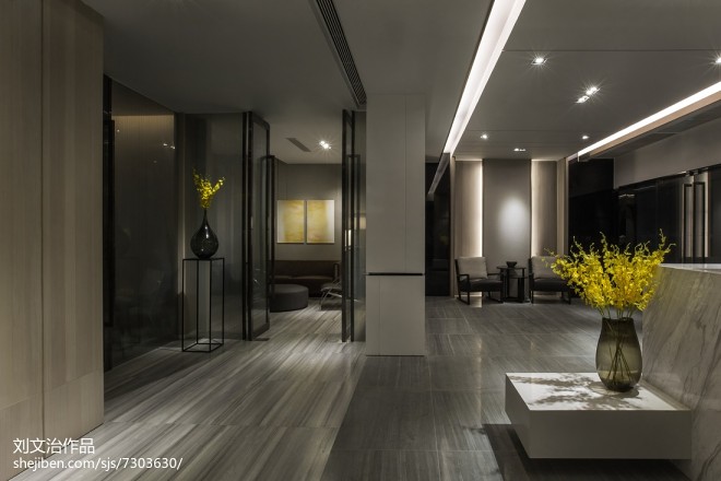
广州惠祺贸易有限公司办公室
参考造价:暂未填写|
空间:办公空间|
面积:350平米|
浏览数:2630
案例简介 Case description
这是一个很小的办公室,让空间增加层次感是我们的出发点,把空间中视觉中最长的斜对角线作为视觉延伸的关键,通过深浅,高低,前后等关系增加空间中的丰富性,企图让人迷失在空间,让时间停留,而这样的结果是各个空间的融合中,让人在工作之余可与增进团队的建设和凝固力。工作不仅是在战斗的空间。更应该是情感产生的场所。This office is quite small. In order to increase the sense of depth of the space, we decide to make the room larger visually. Diagonal line, which is the longest in the visual space, is the key for visual extension. By visually adding the depth, height, and length of the space, the office will look larger. It seems people may get lost and time stops in this space. This kind of design may contribute to the team construction and the improvement of group cohesiveness. This is because working space is not only a battlefield but also a place in which staff will inject their emotions.


相关推荐
金蝶云大厦丨遇见湾区商务新峯景!
林碧瑞|光场解构—观衍上办公场所
珑腾设计丨臻晨,德式美学下的极简表达

所有评论 ( 0 )

设计本官方微信
扫描二维码,即刻与本本亲密互 动,还有更多美图等你来看!
免责声明:本网站部分内容由用户自行上传,如权利人发现存在误传其作品情形,请及时与本站联系。
©2012-现在 shejiben.com,All Rights Reserved.
评论( 0)
查看更多评论